Flora
Branding and Packaging concepts for a feminine and elegantly youthful fragrance brand.

Flirty, Delicate, Enchanting
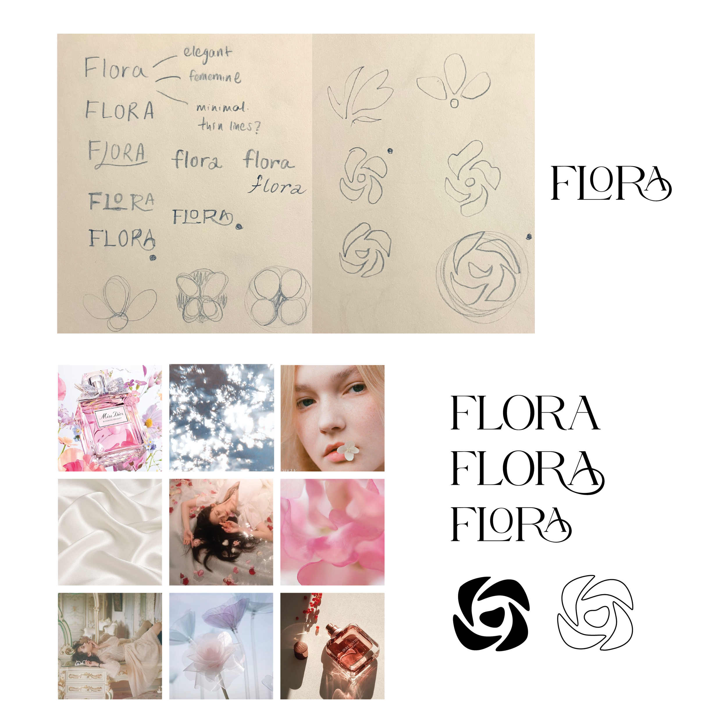
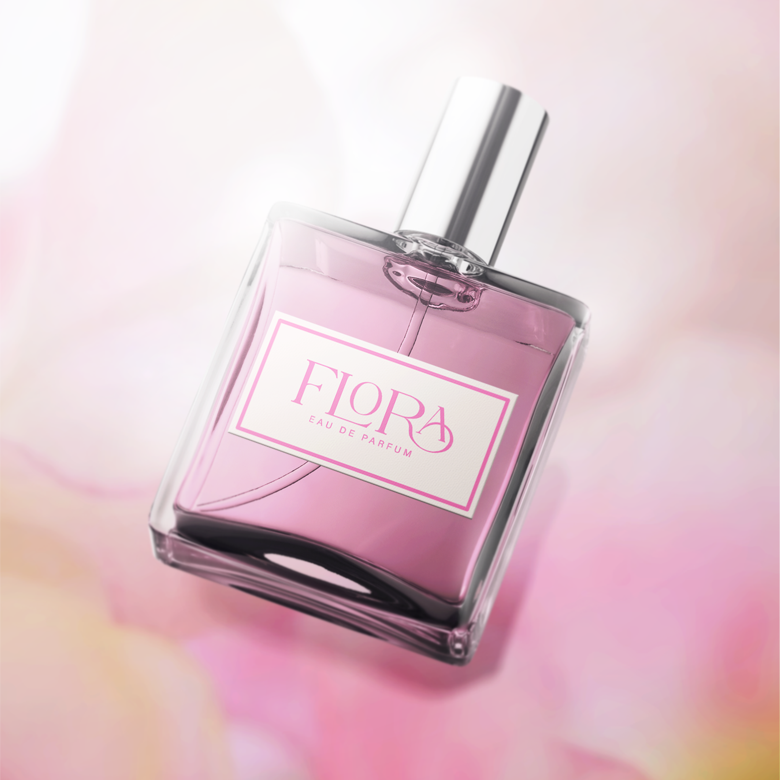
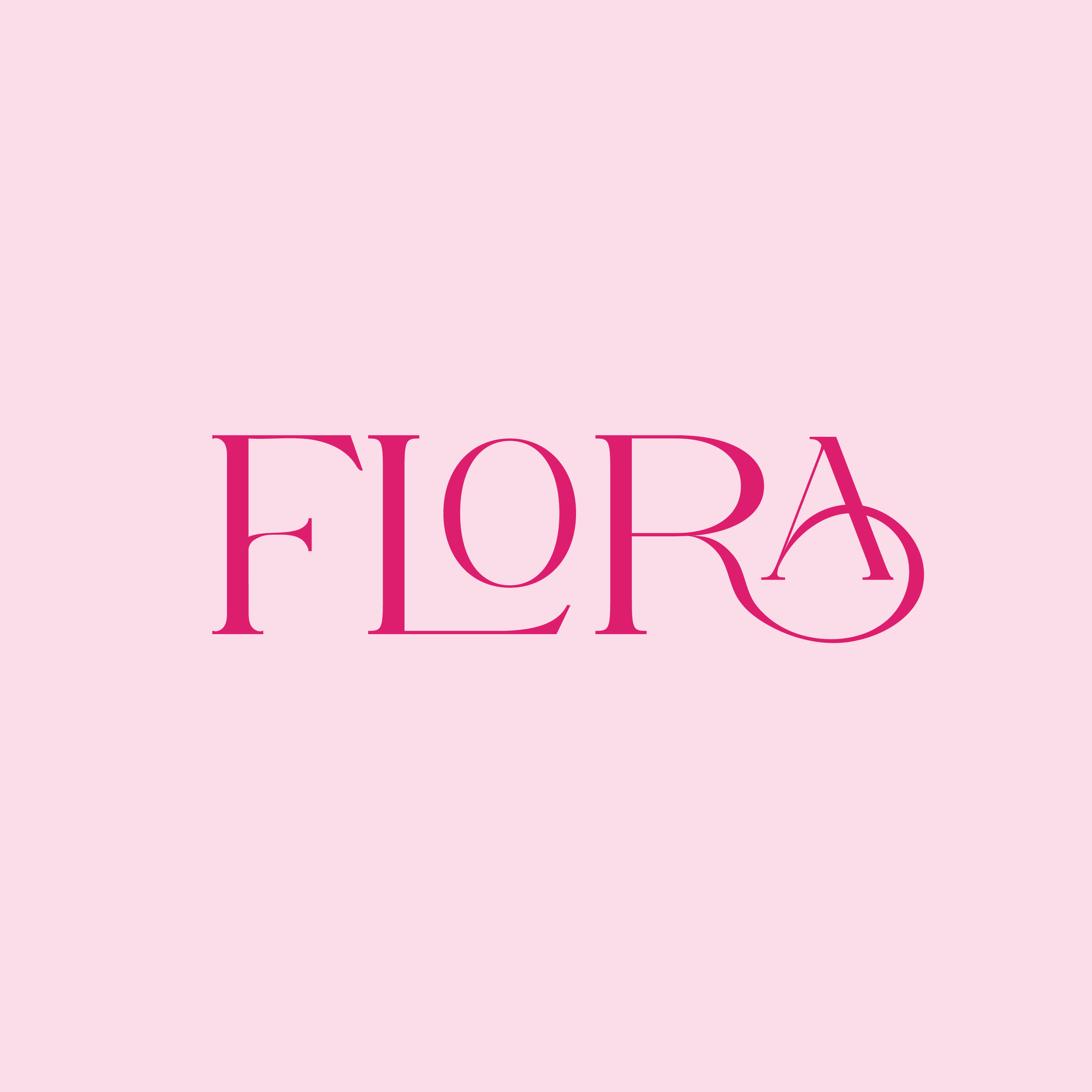
These are the three words that kickstarted the concept for the branding for Flora— a fragrance brand whose demographic is predominantly women in their late teens to 30s. The blend of soft pinks, creams, and yellows are chosen to allude to a more girlish and tender feeling. The font, created with a serif base with the added curves and swooshes, gives off a more mature and elegant feeling— perfect for young women who want to feel a bit more sophisticated without intimidation. Nothing is designed to be too pretentious, from the product design to the packaging. Flora aims to invite young women stepping into adulthood to bloom using their scents.
-
![]()
Branding Iteration 1
-
![]()
Branding Iteration 2
-
![]()
Branding Iteration 3
-
![]()
Logo Iteration 1
-
![]()
Logo Iteration 2
-
![]()
Wallpaper 1


The Process:
A look into the mood board, sketches, and early brainstorms for Flora concept.